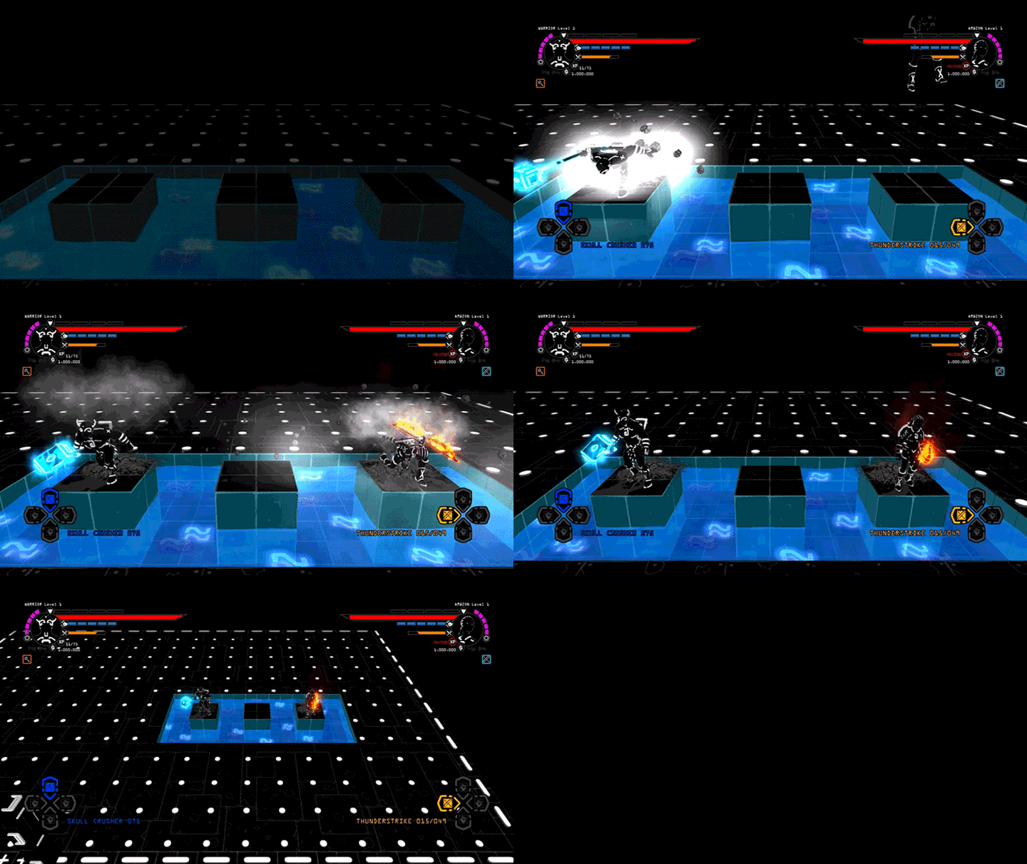

Between its history, artstyle, and title, Brut@l is a unique game. With these features, it’s certainly a head-turner, but initial impressions can only get a game so far. As a rogue-like (in a time where gamers are flooded with rogue-likes), it needs to impress mechanically. It has to be addicting, egging the player to play one more level, or give the game one more try. It has to straddle the line between severe challenge and frustration. And if it has co-op, it better execute well, so the players are really striving together against the game. But sadly, I found Brut@l to lack these elements, despite my desire to really like this game.

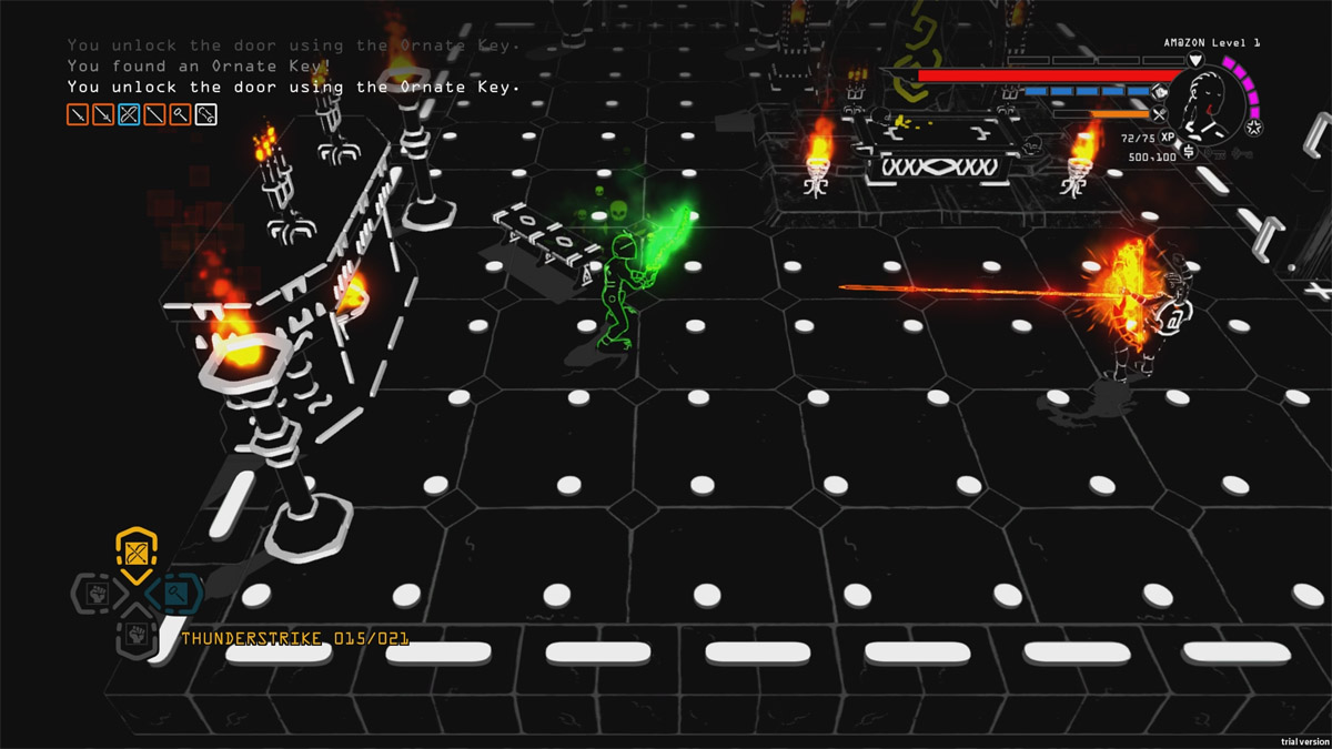
Let’s go back to the beginning and flesh out what I meant by “history” and “artstyle.” Brut@l is based on an ASCII dungeon crawler, which is a pretty far stretch from modern 3D video games. Some of you may be familiar with ASCII from the Atari and ZX Spectrum days of gaming. Others may have a history with it surrounding 90’s chatrooms and fancified game walkthroughs. For all you kids out there, ASCII is the ancient and revered artform of creating pictures out of common typed characters (such as periods, commas, pound signs, etc.). Brut@l fully embraces those roots, right down to the primarily white on black aesthetic and typed characters being incorporated within the maps and character designs of the game. All this, while still being a full 3D dungeon crawler experience.

Continuing the tradition of those old school dungeon crawlers, the game is a rogue-like with both single-player and 2-player local co-op options. These two experiences are largely the same, so most of what I’ll talk about concerning the co-op will apply in single-player as well. Upon starting a new dungeon and selecting characters (from 4 possibilities: Amazon, Warrior, Wizard, and Ranger), players are dropped into a procedurally-generated dungeon. The map is revealed slowly and looks like a classic ASCII dungeon when zoomed out (a nice touch). Players explore rooms, fight enemies, and pick up potion ingredients, weapon recipes, and food. When players get enough XP, they level up, allowing them to select a new skill. These are primarily passive (e.g. larger inventory space, more health), but there are some that are active (e.g. a huge jump attack which costs mana). Players also collect letters (of both the regular and enchanted variety) that allow them to craft and enchant weapons. Then, when they find the floor exit, they delve down into the next floor. It all keeps going until the players run out of lives, with the main goal being how far players can make it this time.
All of this sounds good on paper, and what players would expect of a classic-inspired, rogue-like dungeon crawl. And the groundwork is solid. The ideas (e.g. potions having hidden effects until you consume them, weapons that are crafted out of letters players find throughout the dungeon) are good, the aesthetic is appealing, and the game is easy to jump into and understand. But in actual gameplay, Brut@l fell flat for me. It’s really a shame because I certainly wanted to love it. I like so many of the ideas, but it was a bunch of small things that added up to this feeling of it being an average game.
While the game has four classes, each with their own different model, they’re all quite similar. All characters share the same skill tree, but start off each game with a different handful of skills unlocked (e.g. the Wizard has skills unlocked that make his mana pool larger while the Ranger has skills unlocked that make him better with bows). That, in and of itself, wouldn’t necessarily be a bad thing, except these skills don’t really make the characters feel any different. As in many a classic dungeon crawler, players are mostly running around hitting things (literally with their fists for a while). When I picked the Ranger, I thought I would be running around and hitting things with a bow, but I didn’t even start the game with one. In fact, the Ranger didn’t all that different from the Wizard. I never even got my desired bow; instead, I wound up with a sword since that’s the recipe happened to find and was able to build. I had a bow recipe, but I wasn’t able to find the last letter I needed to craft it. So, in the end, my Ranger felt more like a dude-with-a-sword. My Warrior partner was a dude-who-punched-things. This was disappointing, because when I see different classes, I expect them to feel different in these types of games. Yes, we unlocked more skills as we went, but none of them felt particularly exciting or particularly class-defining. Instead of your class defining your character, it felt more like the recipes you find dictate how you probably want to skill up your character. Since you never know what you’ll find, class selection feels a bit more like “what character model do you like more?” and “what weapon would you prefer to use if you can find a good recipe for it?”
I would have been able to forgive much of this disappointment had the characters still had ways to combo their skills together or help each other. Not so. As I like to say about many MMOs these days that have made everyone a damage dealer with few way to support their friends, the only real cooperation found here is people flailing around at enemies in a room… together. The other people in the room could be missing and the gameplay wouldn’t be any different. Certainly a level of character individualism is a good thing, but when a game says it’s co-op and the only real “co-op” is the ability to play with someone and I can resurrect them. Resurrecting your partner also actively hurts you (you sacrifice 50% of your health to bring them back to life).
And again, I would have been able to forgive the game for some of this, had the level of challenge been good and interesting. At least I could flail around in a room with my partner and feel that we were facing adversity together! But no, the challenge curve in Brut@l is exceedingly strange. There was very little chance of dying from traps or enemies, but one misstep from platforming resulted in a death. Unlike when a player simply dies from running out of health, when a player dies from falling, their body ends up back at the start of the level and their partner needs to trek all the way back to resurrect them. This juxtaposition of quite easy combat to instant falling death made the pacing feel very off.
The last sticking point, for me, concerns the look of the game. After playing for a while, it began to hurt my eyes. It wasn’t the white-on-black coloring or even the environment. It was the characters themselves; 3D shadowy models with characters stuck onto them in clever ways to make up their features. As still pictures, I like how they look. In motion, they resulted in eye fatigue. And that’s a real drag because, as I said, I really like the aesthetic of the game. For me, it’s the biggest thing the game has going for it, but in the end I probably would have preferred something more generic to save myself the eye strain. The aesthetic makes it stand out from the crowd, but that’s really the only thing that makes it stand out. That doesn’t feel like enough, especially when some players may find it to be functionally uncomfortable.
Even with a number of drawbacks, Brut@l isn’t game that I would classify as “awful.” As I said in my opening paragraph, there’s nothing broken about the game, or even unjustifiably frustrating (provided you can handle rogue-likes and all that entails). It’s just that at the end of the day Brut@l is a very vanilla rogue-like in a time period where gamers are bombarded with rogue-likes and rogue-lites. The co-op in Brut@l doesn’t offer anything especially interesting, either. The biggest thing co-op brings to the table is resurrection, but when the a player has to resurrect a player after a falling death, it's really more of an annoyance than a positive feature. I’m sure there are gamers out there that will like what Brut@l has to offer, but I can’t count myself as one of them.