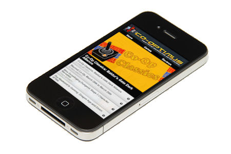

Today we're proud to announce the mobile version of the Co-Optimus website has officially launched. With it comes a portable version of Co-Optimus, accessible by numerous devices like Android Phones, iPhones and BlackBerry smartphones. The mobile site is built on HTML5 standards and utilizes a resource light view into the world of co-op gaming.
To access the mobile site all you need to do is bookmark http://m.co-optimus.com in your favorite mobile browser, you'll also be forwarded there automagically if you visit the main page via a mobile device. You always have the choice to switch back to the normal site view by clicking the link in the footer.
We still plan to launch mobile apps sometime this year for Android and Windows Phone 7. The mobile site may see further functionality later in the year as well depending on community feedback. Please let us know what you think!