Balancing the Maps
Each map in The Red Solstice is changing along with the development. Some maps are harder, some maps are easier, some lack items, some have too many things going on or are so big that you have to play them differently.
We wanted to give each type of player something they would like. For example, the central map is very balanced in all aspects while the military map is pure carnage, consisting of heavily increased monster spawns. Maps also have various modifiers or different objectives, making them vary in difficulty when compared to each other.
Power to the Players
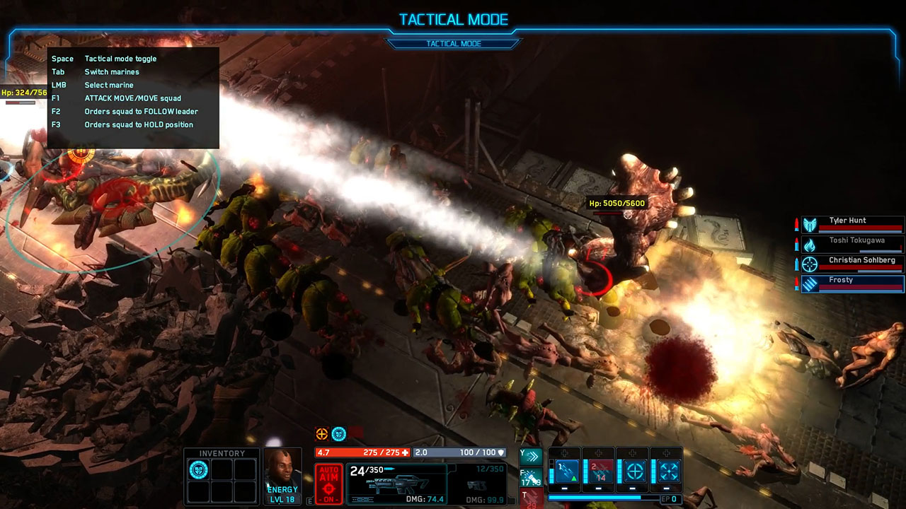
One thing we are still having problems with - and to me personally is one of the hardest things to do - is to empower the players without patronizing them. We want to give them a true sense of power for every action they do, for every skill or item they use, or simply for performing important actions on the map. For example, we look up to Dawn of War for doing this extremely well, and that’s not an easy thing to do.
UI Issues and Development
We had big problems finding the right UI for The Red Solstice because of the new mechanic we introduced (component-skills system). Since in The Red Solstice you can level up or level down a component to gain certain skills, you have to show both choices to the player. Our first UI iteration looked like this.

This proved to be inefficient very quickly because we realized players need to see which skills belong to which components fast, so we searched for another solution.

This solution was slightly better but still had issues. For example you can see the components on the right side, so they’re easy recognizable, and the skills you gain from them (blue icons just to the left of the components). Big problem with that UI was that it was not entirely clear to new players what was going on. All of this eventually lead to our current solution where we decided to hide the components almost entirely.

We realized there is no need to show everything by showing just the skills and ability to level them up and down, we found a way to blend in components with the skills themselves. By grouping together all the skills - regardless if they are active or passive - under one component "slot", players can more easily determine how they want to level up or level down the components.

In the end, we would like to mention that The Red Solstice would never have been made without the help and support of the members of the game development industry. Game developers especially, but not limited to indie ones, have shown tremendous collegiality and went to great distances to share their know-how, contacts, and so on. We could never name all of them without doing someone injustice, but they know who they are. A big thank you to all of you guys and gals!
Our thanks to Hrvoje for taking the time to share with us their development experience. You can check our co-op review of The Red Solstice on the site, and purchase the game on Steam.
