In part 1 of our Q&A with Chris Park, Founder/CEO/Lead Programmer/Lead Designer of Arcen Games, we discussed Arcen's unique approach to game design and development; specifically, how none of their games can really be classified by one genre but are an amalgam of different concepts and mechanics. We then went on to discuss one of their recent releases, A Valley Without Wind 2. In part 2, we look at the other recent release, Shattered Haven, and a glimpse into what's next.
Co-Optimus: Shifting gears now to your most recent release, Shattered Haven. I really like this game, and I really want to like it more. So let’s knock out a couple of the issues I see with it. First, in all honesty, why 100 levels? While the first few levels are meant for tutorial, was there ever consideration to maybe trim down the overall number (and possibly lengthening a few levels) to offer less quantity and more variety to the player?
Chris Park: Well, I think there’s already a pretty hefty amount of variety here, to be honest. Having 100 levels certainly makes for some repetition, but I think it’s well spread out and there’s something uniquely challenging in each level. It’s not something tight like Limbo, though, you’re right -- you don’t just solve each vague kind of puzzle once. Instead we explored many permutations of each kind of idea.
It’s a different sort of design philosophy, and I guess an older one. My model for this game was Lode Runner: The Legend Returns, which is an old favorite of mine. It had tons of levels, but I never felt like it had enough. And some of its earlier levels were pretty direly simplistic, so that made the number of real levels much lower. None of our levels are remotely that simple, so to me we’ve made huge strides over that.
Co-Optimus: I realize that those 100 levels also represent a huge amount of investment in level design and careful planning - the placing of the “Grays,” obstacles, and weapons is no happy accident. How much time did it take for the average level? How many levels were left out of the final product?
Chris: Well, it really varied. It was also spread out over four years, so it’s hard to really answer that definitively. Most of the levels were created in the span of 8 months during 2008, by my wife and I. She did around 30, I did around 60.
Then starting in 2012, all of the levels were tweaked and updated heavily by myself and Zack, an excellent level designer friend of mine that we contracted for this title starting in late 2012. We (mostly Zack) did things like improve level layouts, add bits of extra interest to puzzles, and most of all completely revamp much of the overworld areas so they were more interesting. Erik, Zack, and I spent a lot of time on the phone fleshing out the nuances of the story and its various branches, and then Josh and Zack and I spent a lot of time actually scripting that stuff out for the cutscenes and so on in the game.
So it was really a concerted effort by a small team over a span of several years. In terms of how long it takes to do a single-screen level just starting from scratch... well, I did one for Youtube as a Let’s Play of how to use the level editor, and completed it in under 45 minutes. That was a fairly straightforward level with only one screen, and I already had the design pretty solidly in my head, though; some of our overworld areas have 27 screens, which takes vastly longer not only to implement, but to design.

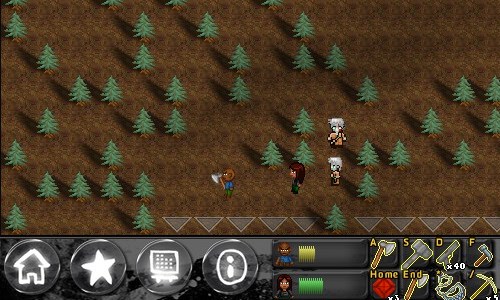
Co-Optimus: So the second issue. The top-down perspective is a great design for this type of game, but the characters and objects can be easily lost. This is especially true at the higher resolutions at which a lot of PC gamers play these days. Was there, or is there discussion, to tweak the graphics in some way so there all the different on-screen elements don’t blur together quite so much?
Chris: The game defaults to a lower resolution, and anyone who is increasing the resolution is doing themselves a disservice unless they have a larger monitor. That’s like taking To The Moon and trying to look at it in 1080p resolution: it would be tiny. Same with Lone Survivor and other pixelart games. You increase the resolution and they get smaller, not crisper. All that said, we provide the option because there are lots of different monitor setups, and if you have a 30-inch screen in front of your face then smaller is actually better.
I don’t really agree with the criticism that the elements get lost in the background if you’re playing on a reasonable resolution for the game, to be honest. Except for the things that we intentionally made blend in, like snakes in the weeds, etc. Some of those things are intentionally made a bit hard to see, and they stay very still for that reason -- this is a horror game, after all. But in the main, 97% of the time the enemies are moving and chasing you, and I think the motion along with the style of the graphics makes them appropriately easy to see.
This is just my opinion of course, but it’s also not an issue that we’ve had any feedback on from players that wasn’t solved by “use a smaller resolution.” The response to that was “oh, all right, now I can see what’s going on!” If To The Moon let you change the screen resolution and you didn’t have a large enough screen to where that made sense, it would be utterly incomprehensible, too. I did consider taking away that flexibility to choose resolution, but I felt like just defaulting to something sensible and keeping the options open for players would be better in the end.
